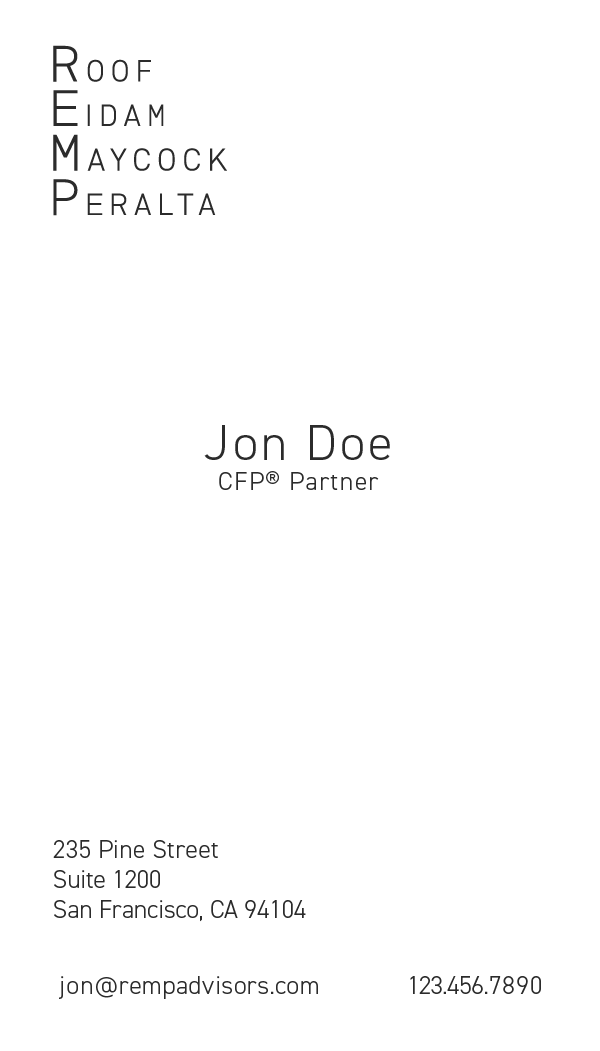
REMP
BEFORE - OLD LOGO
The old logo also had some issues, primarily it needed to be updated to accommodate the new partner. There were also visual inconsistencies with the old design, the spacing and sizes of the boxes were not even and nobody was a fan of the color choices. The "&" was overpowering the other letters and the subtext under the main body was lost when printed small. There were a lot of revisions when coming to the final logo design, but I believe the final design solves previously mentioned issues as well as positions the brand more in line with how the firm conducts itself.
BEFORE - OLD WEBSITE
Review of the old website revealed there were a lot of issues that needed to be addressed. First off the website had not been touched in the last 10+ years, meaning a lot of design choices did not age gracefully. Some mentionable choices are large bodies of text, drop down menus, and pages only containing one paragraph. Along with many design and functional issues, a 3rd party was managing the site which only complicated things more. The combination of these issues made it obvious that the website needed to be rebuilt and be kept completely internal. The new website was completely designed and coded by myself and I believe it addresses all of the concerns with the old site as well as give a better sense of what the client stands for.
COMPETITIVE ANALYSIS

Before I dove into redesigning the brand and how it would extend across all marketing touch points. I felt it was important to get an understanding of the competitive landscape by focusing on the California competitive set. I then aggregated their styles and plotted them in a magic quadrant grid that held two ranges - Inclusive to Exclusive, and Futuristic to Traditional. I noticed that many firms had moved their branding to be more futuristic and soaked in blue, which makes sense considering the affinity of blue tones in Tech, the Bay Area's source of uncommon wealth. The top right quadrant which covered Futuristic and Exclusive seemed unpopulated, and frankly, meshed well with my client's positioning in the market where they do no advertising, no outreach, and only take on new clients through personal referrals.
LOGO DESIGN VARIATION

Obviously the new logo would not be completed in a single go, there was a lot of iteration. Pictured above are just a few of the different designs I presented to the client during which I would explain my thinking and reference the research I conducted. The same process was also done to the font type which was used as a starting point for these logos.
AFTER - NEW LOGO
The new logo I feel captures the energy the firm has in a more accurate way than previous designs. This design was one of the dozen of iterations that I created, but was the one that did the best in every scale and context. Not only does it excel in a printed format such as a business card or letterhead, it also holds up on desktop and mobile websites. I wanted to get rid of distracting design devices such as the "&", squares, and subtext that disappears when scaled down. The logo and branding should reflect the company and I believe a strong, confident, clean logo with a clear message in this case was the best choice. This also allowed for more customization for the partners, with the logo as a neutral color, this allows each partner to have their own identity within the firm; this can be seen on the new website as well as business cards.
AFTER - NEW BUSINESS CARDS

AFTER - NEW WEBSITE
With the new website I wanted to continue with the style the logo had, simple and strong. I kept the colors to a minimum, white with each of the partner's unique color. While scrolling the site, the background will change according to each partner's color. This theme also carries over to the print media and especially with the customized business cards. I could keep talking about why I made certain decisions, but I think it would make more sense to just see the site first hand. The project can be found at rempadvisors.com and the source code is on my github.
ROGUE ID
NEW WEBSITE
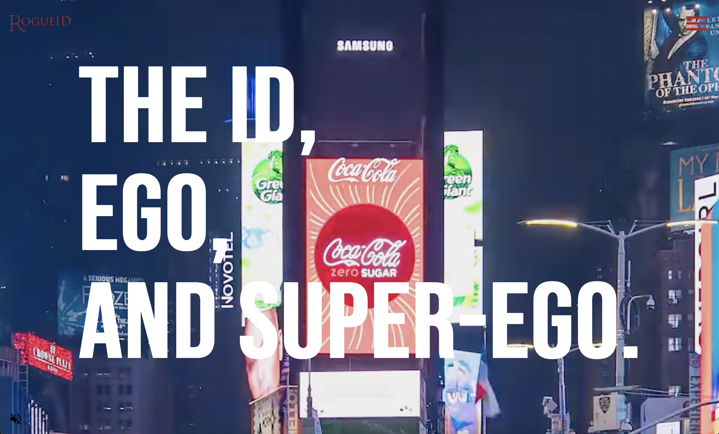
I was lucky enough to have the opportunity to build Rogue id's new website and brand identity. You can see the website at rogueid.com and the source code is on my github as usual.
NEW LOGO
The new logo design was based off ancient Roman lettering. The 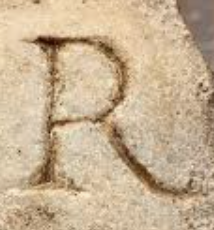 in particular was designed
completely on my own with inspiration originating from old Roman carvings; this was paired with the font
Trajan Pro.
in particular was designed
completely on my own with inspiration originating from old Roman carvings; this was paired with the font
Trajan Pro.
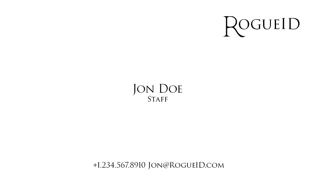
NEW BUSINESS CARD
CUSTOM SHIRT DESIGN
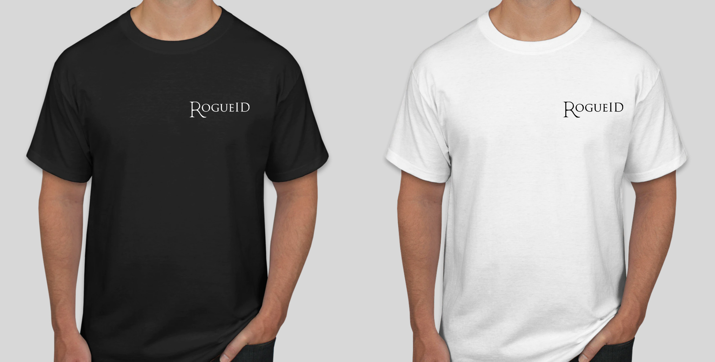
Using the new logo I designed, company shirts were made to use as swag.
ANIMATED MEDIA
I also got the chance to work on pitch decks and animated media for client meetings and pitches.
Primo Angeli
ARCHIVE WEBSITE
Primo Angeli, who sadly recently passed, was someone I met as a small child and was tremendously influential on my belief in the possibility of a creative career. His work and worldview inspired me and countless other art school students to pursue design. After graduating from university I was fortunate to be able to work with him and his team on his retrospective website located at primoangeli.com.
Mulder Design
PORTFOLIO WEBSITE
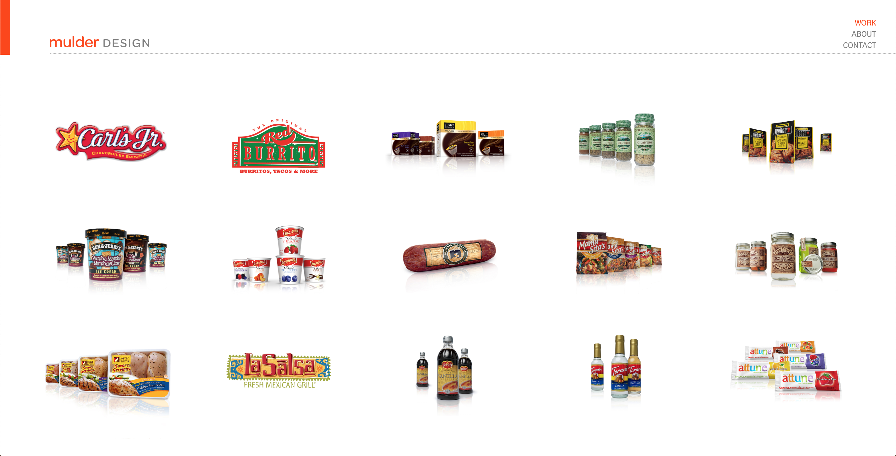
I got the opportunity to work along side Oscar Mulder who has an impressive background in package design and logo design. He also now runs a children's toy company focusing on promoting healthy activities. I was able to not only build his portfolio website but also help with the e-commerce side of his toy company. You can check out his portfolio website at mulderdesign.com.
Stapley Hildebrand
AGENCY WEBSITE
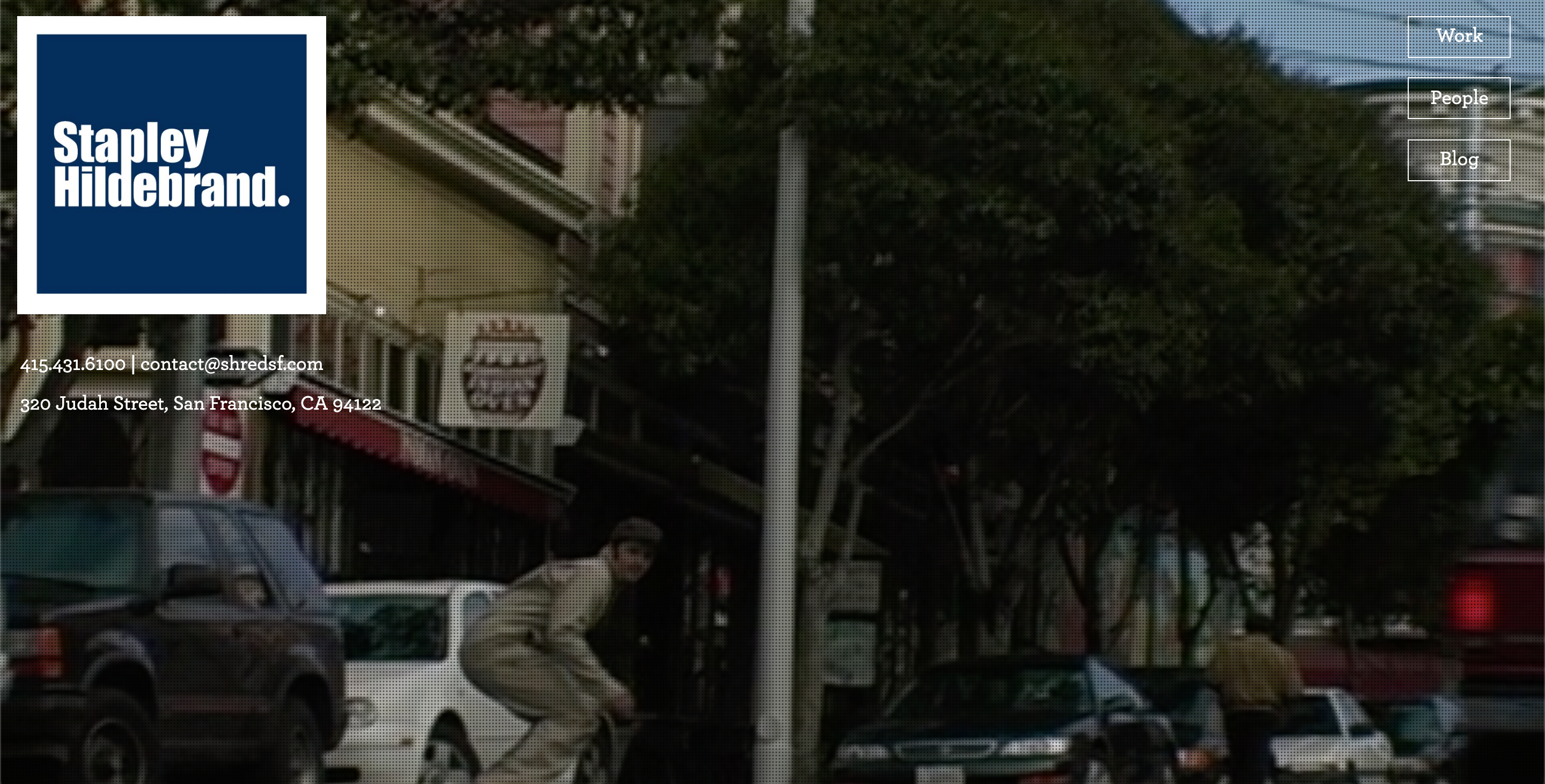
Soon after graduating college and completing a Web Development immersive in San Francisco, I got the opportunity to intern at Stapley Hildebrand which is a package design agency. I completely redesigned their previous website which was built using SquareSpace to something that I thought reflected their style and attitude more accurately. Since then, the site has gotten some updates while, in my opinion, preserving the energy I instilled in the original design. You can check out their website at shredsf.com.
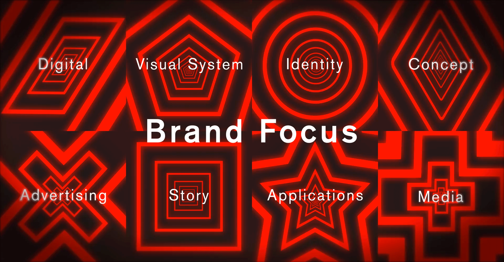
Illustration & Video
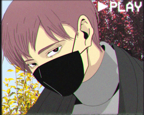
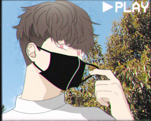
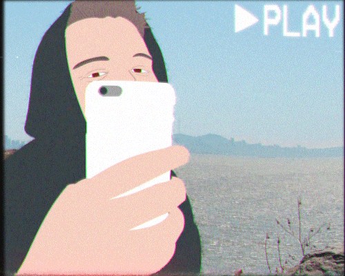
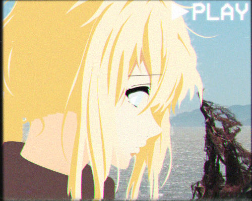
ANIMATED GIFS
GIF 2
GIF 3
GIF 4
GIF 5
GIF 6
Series of quick animated gifs consisting of illustrations, video, and effects created completely from scratch using Adobe After Effects and Photoshop.
Memory Game VR
STREET VIEW
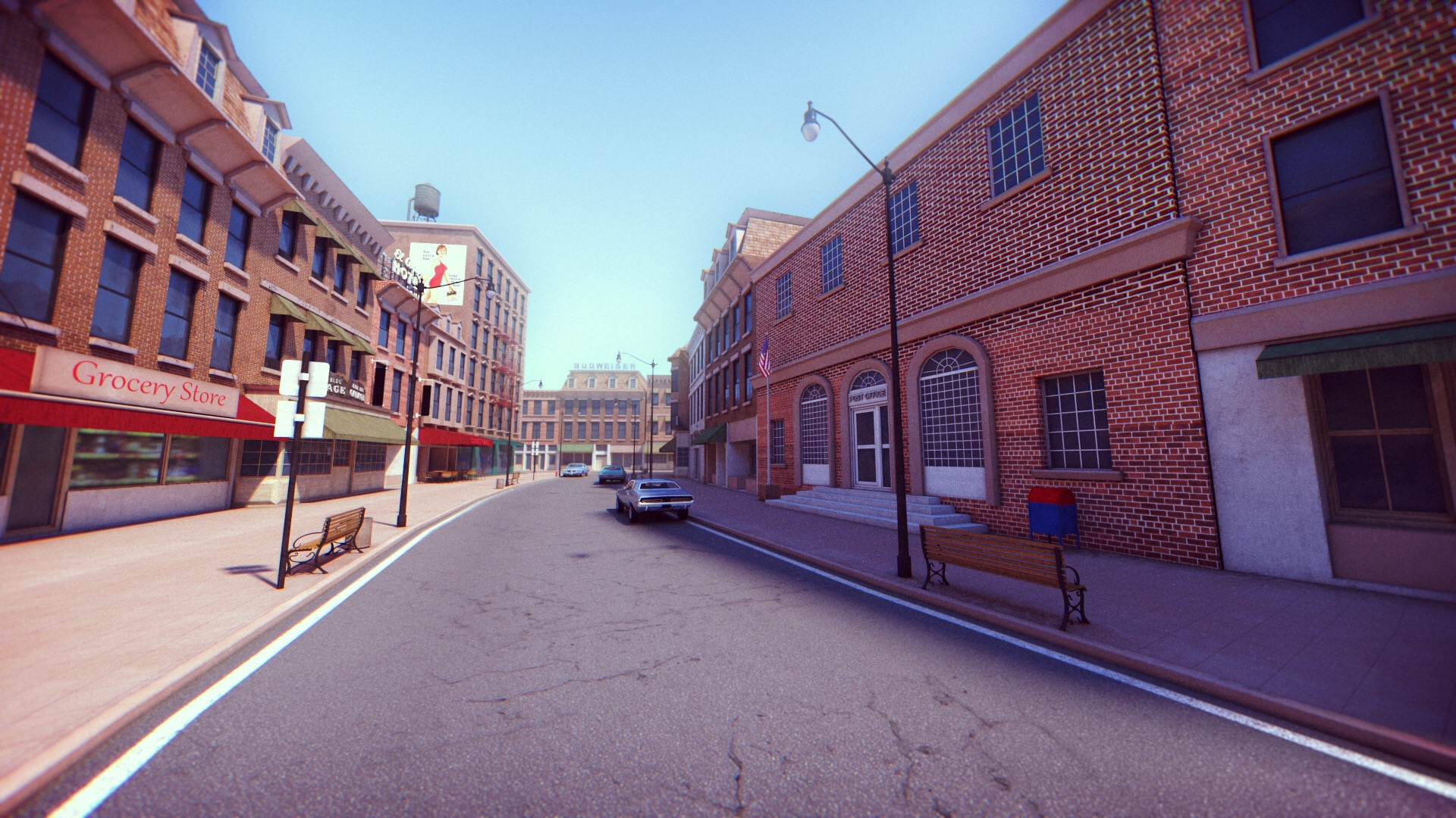
AERIAL VIEW
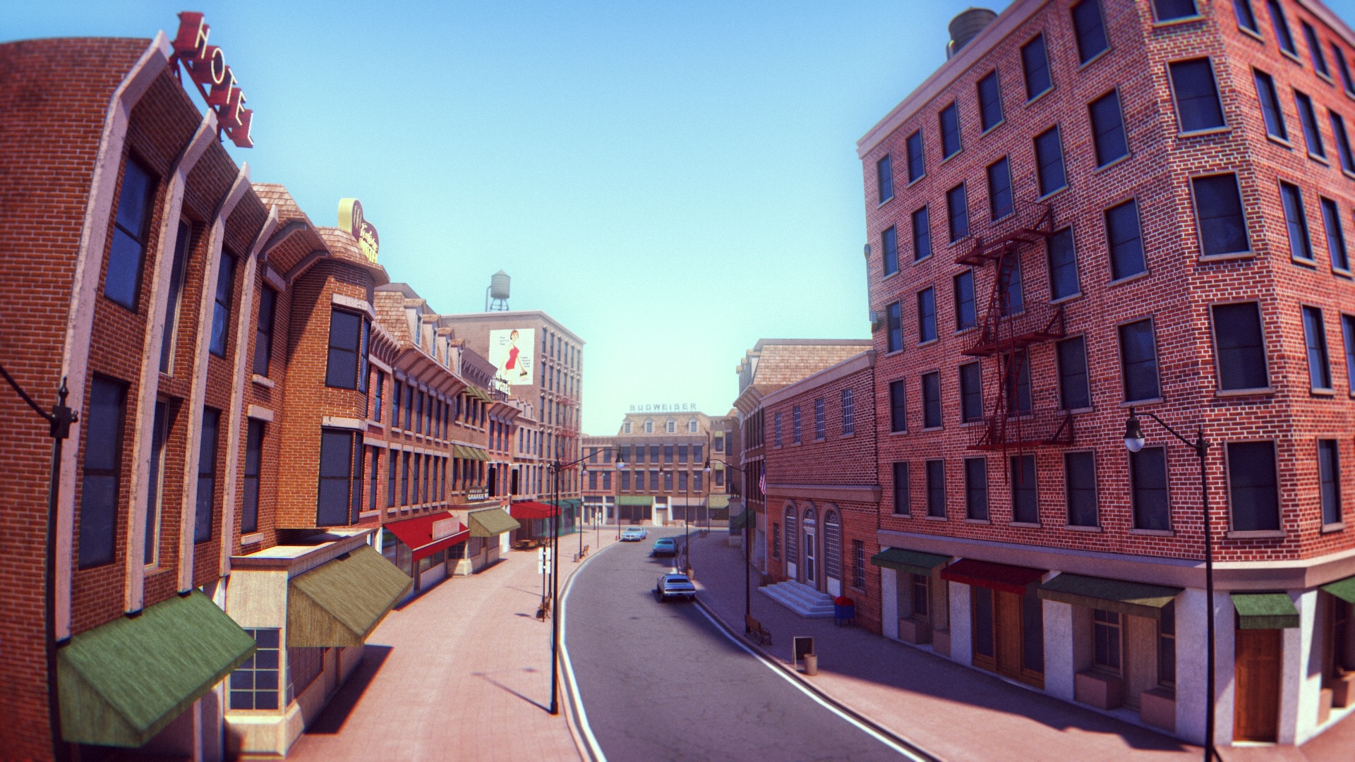
STREET VIEW
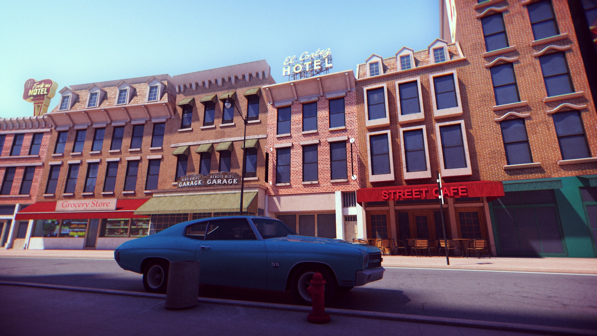
For my college capstone project, I worked with a small team of students and developers to build a Virtual Reality experience aimed to assist individuals in the early stages of alzheimer's. We worked alongside a local care center in Berkeley to get feedback from the staff. This game also earned a few awards, the most notable was the Gold Stevie Award.